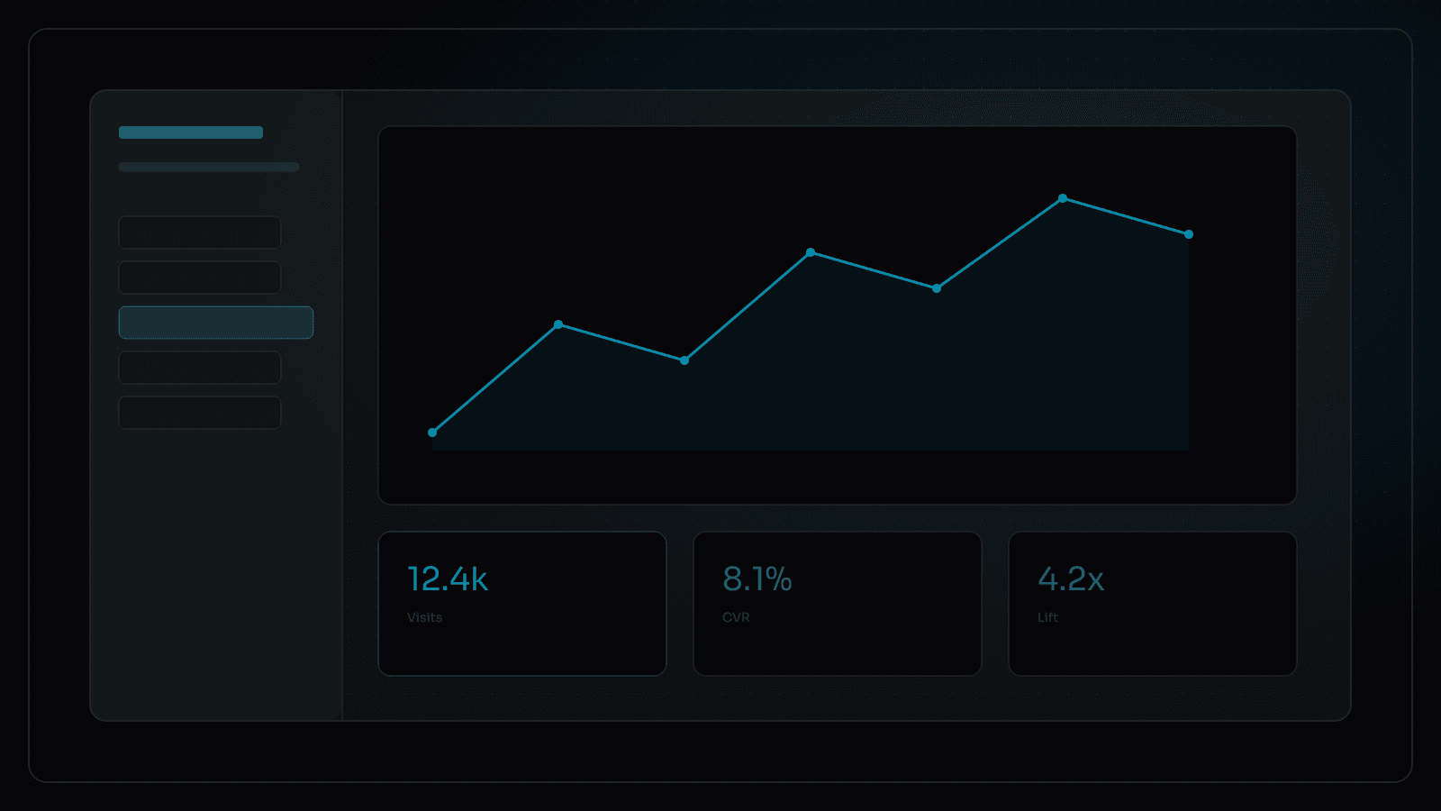
Ask for the Report, Not Another Dashboard
Custom analytics get more useful when they include website context and can answer plain-language questions from Slack or internal tools.
Most teams do not need more charts. They need answers that match how they decide.
That is why we build custom analytics reporting around the website itself, then connect HubSpot, Google Analytics, and whatever else actually holds truth. The goal is simple: ask for the cut you need in plain language, and get something useful back.
The problem with dashboard-first analytics
Dashboards are good at showing what happened. They are less good at answering the question someone is actually trying to settle in a meeting.
So teams export CSVs. They rebuild the same weekly report by hand. They argue about definitions because “landing page,” “campaign,” and “demo request” mean different things in different tools. The website, which is often where the demand started, sits outside the report instead of inside it.
Custom analytics reporting flips the order. Start from the decisions the team makes. Then shape the data, website context, and delivery channel around those decisions.
What website context adds
Website context is the missing layer in a lot of marketing reporting. Page templates, content types, update history, IA relationships, and conversion paths are not decoration. They explain why a metric moved.
When the reporting layer understands website structure, questions get sharper:
- Which landing pages linked from the homepage went stale this quarter?
- Which posts drove demo requests, not just traffic?
- Where did high-traffic pages drop in engagement after a messaging change?
- Which sections of the site support pipeline, and which are mostly noise?
Without that context, you get charts. With it, you get explanations your team can act on.
In practice
Instead of exporting CSVs every Monday, marketing asks Slack for the top landing pages this quarter, which posts drove demo requests, or which high-traffic pages dropped in engagement. Follow-ups stay specific because the reporting layer already knows how the site is organized.
We have done this for teams like Canopy, where the reporting tool lives in the operating environment and pulls the data they already trust. The value is not a prettier chart. It is less time spent hunting and more time spent deciding.
What changes for the team
- Less dashboard archaeology
- Reports shaped around real meetings and KPIs
- Website context included, not bolted on later
- Cleaner handoffs between marketing, leadership, and ops
- A path toward AI agents that can answer the same questions
Custom does not mean complicated. It means fitted. The best reporting layer is the one your team will actually use because it matches how they already work.
Where this fits with AI-powered website solutions
Custom analytics gets stronger when the website itself is structured and operable. An AI-enabled website gives you trustworthy page and content context. A website MCP server makes it natural to ask for reports from Slack. Lead and CRM signals from on-website lead gen make the story complete.
If your team is still stitching screenshots together every Monday, the answer is probably not another dashboard. It is a reporting layer designed around the questions you already ask.
A good first scope is narrow on purpose: one recurring leadership question, the sources that can answer it, and a delivery channel the team already uses. Once that path is trusted, expand the catalog of cuts. Breadth without trust just recreates dashboard sprawl under a new name.